COMMUNITY
WELCOME
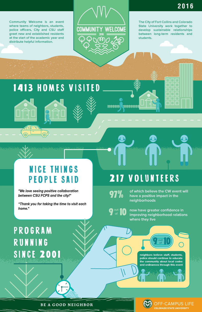
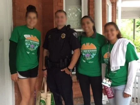
Community Welcome (CW) is a yearly event hosted by the City of Fort Collins and Colorado State University.
Each academic year, teams of neighbors, students, police officers, City and CSU staff greet residents and distribute beneficial flyers.
In 2016, I conceptualized and created the branding, print & digital ads, t-shirts, brochures, and posters for the event.
My Role
art director, graphic designer, illustrator
Year
2016
Project Type
print, digital ads, environmental signage, social, omni channel marketing
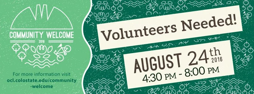
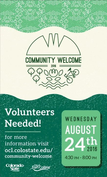
A Logo Rooted in Community
For the year’s event, I created a logo that represented the city and campus. The symbols within are representative of the local community.
The crescent shaped “W” mimics the local mountain range while the wavy lines symbolize a river bisecting the township. The trees represent the roughly 10,000 on CSU’s campus. The bike speaks to the major community bike culture. The central flower represents the University and City’s commitment to multiple flower programs focused on beautifying the town.
From this logo and its symbols, I created the brand patterns and texture that define the ads.
FINAL LOGO
OTHER EXPLORED CONCEPTS
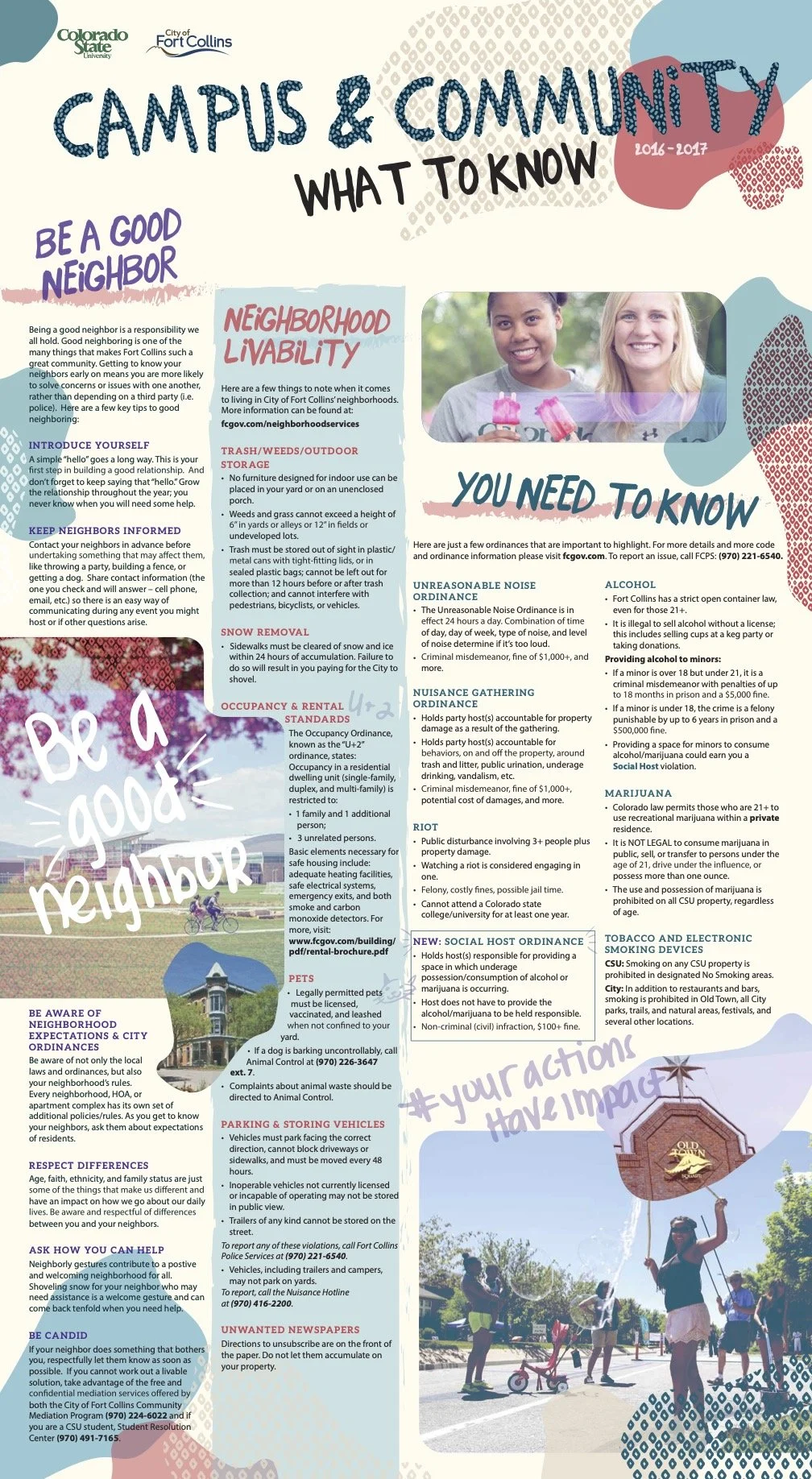
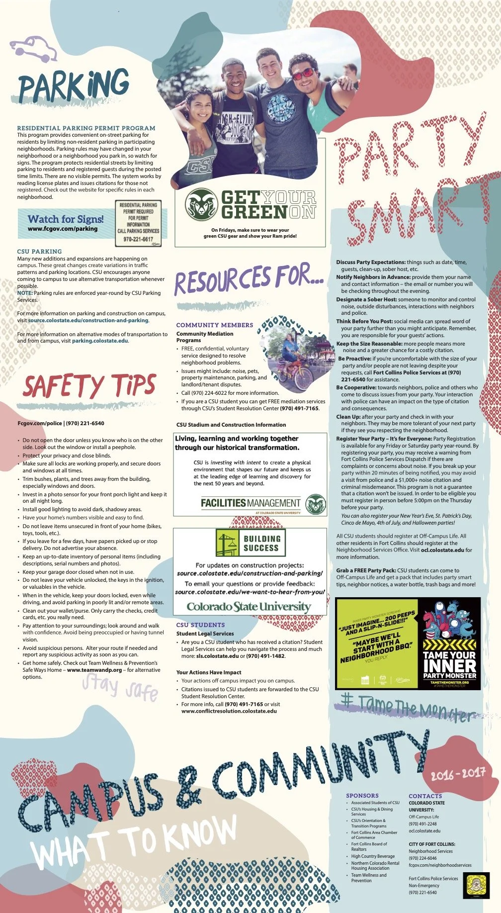
Rethinking Outreach
Historically, CW distributed pamphlets to local residents. The City and I questioned their effectiveness with college-aged recipients. How many students read or keep brochures? How accessible is the information?
To address this concern, we tested posters to encourage students to display the resource in their homes. Feedback showed the posters were effective, with many still in residents homes by CW 2017.
As the poster was for the City of Fort Collins, it did not follow strict design guidelines of the university. I chose bold colors, organic shapes, handwriting, and hand-drawn symbols to create a youthful and engaging poster.
DESIGN STATS
1,500+
posters distributed
200+
shirts distributed